The current dashboard system was not extensible and couldn't support our ever-growing customer base, which began including larger organizations with larger amounts of data, more EHS roles, and more locations and facilities to monitor. With mass amounts of data being generated, the data visualizations and analysis capabilities of the current system were grossly underpowered.
The objectives were to design and build a flexible dashboard system that offered users a library of widgets that could be tailored to their own roles and responsibilities. It was imperative to be able to display the right type of data to the right user who, often, had an assortment of EHS duties and responsibilities, was responsible for monitoring multiple locations, and needed a dashboard that was as flexible as their role(s).
To fully understand who our users were and what types of data their roles were responsible for, the UX analysis began with extensive user research. We first reached out to customers across various industries with a feedback questionnaire gathering information about the usability of the current dashboard system as well as how they leverage it in their day-to-day. After consolidating the feedback and analyzing the pain points and gaps in the current system, we followed up with user interviews to discuss these users’ roles, responsibilities, and data requirements in more detail. The users’ data requirements broke down into 3 categories – prioritization of day-to-day tasks within the system, monitoring and communicating metrics and trends, and analyzing and socializing outcomes. We identified 3 main architypes with varying goals and motivations, tasks and responsibilities, and pain points. Personas and research in-hand, there were 3 major issues to address with the new dashboard design.
Empower a Specific Audience and Addressing Their Needs
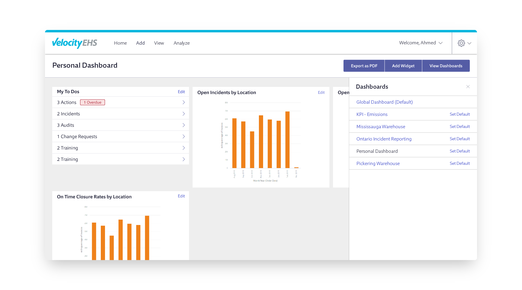
Instead of users’ dashboards simply visualizing all organizational data and forcing them to sort through what’s relevant to them, we designed the experience so dashboard widgets only displayed information that was relevant to users based on their role, permissions, and location, i.e., an EHS supervisor could only view data from the facilities or departments they supervised. The new design also facilitated the use of multiple dashboards so users could organize their data into different views for their various locations, roles, metric types, etc. The grid system designed enabled users to layout and resize widgets however they wanted to prioritize the data that was most important to them.
Presenting the Right Visual
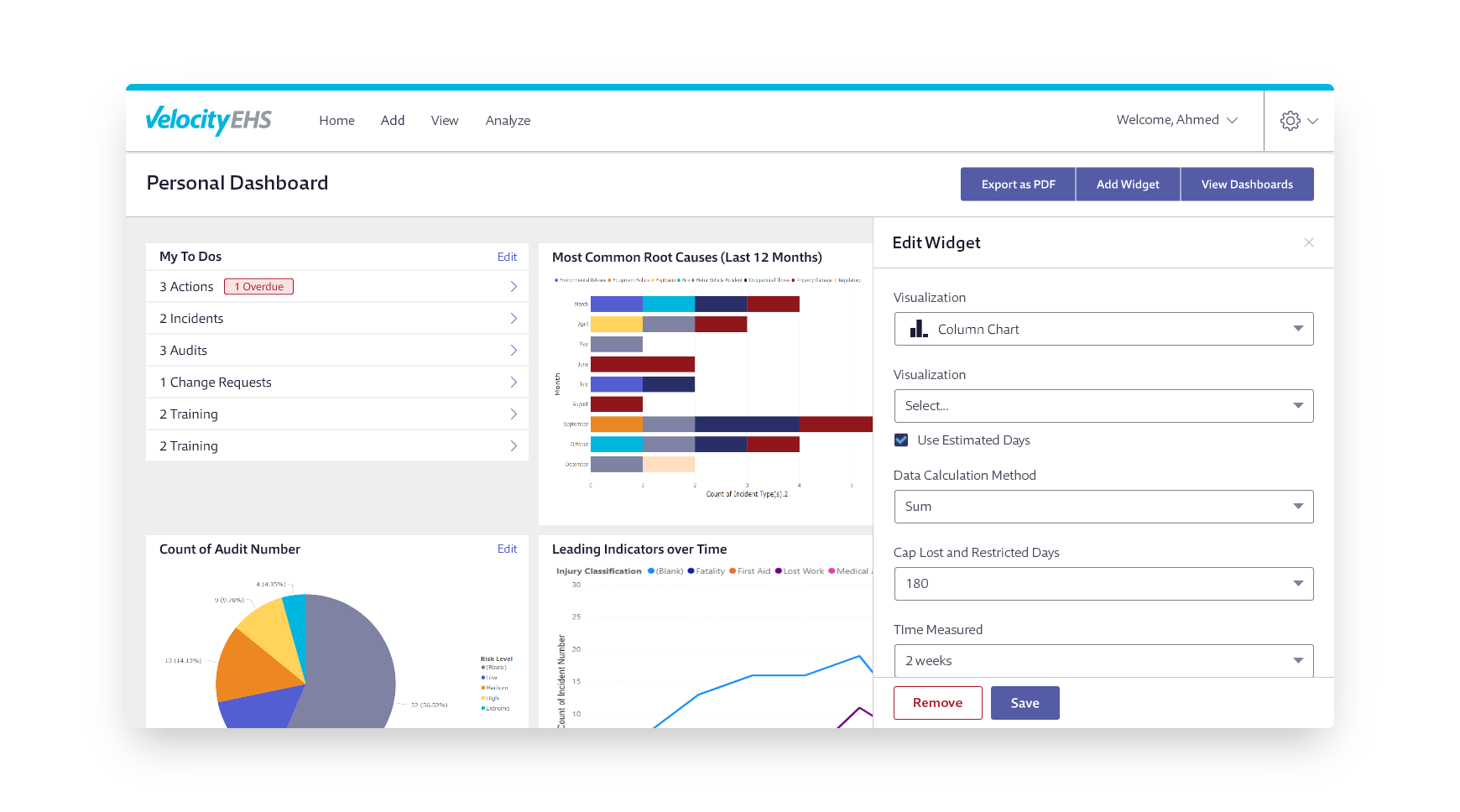
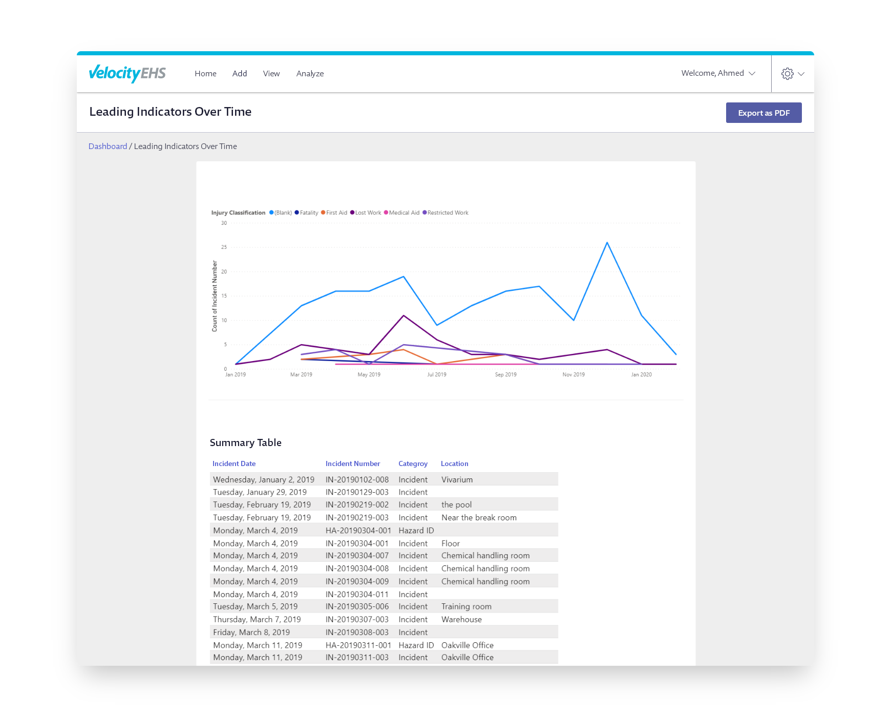
The current dashboard engine was limited in the types of visualizations it could present. With the implementation of Microsoft Power BI, we had much more flexibility to present dashboard widgets using data visualizations that were more appropriate to the type of data being charted, i.e., line charts for changes over time, bar charts for comparative purposes, etc. Leveraging Power BI, we were able to design a variety of widgets to meet our personas’ needs, like daily actional to-dos, most common factors, safety event rates, announcements, etc. To account for the mass amounts of data that some widgets inevitably visualized, we also designed a drill-through screen to allow the user to display a widget in a larger view and have a better, more detailed overview of the data charted.
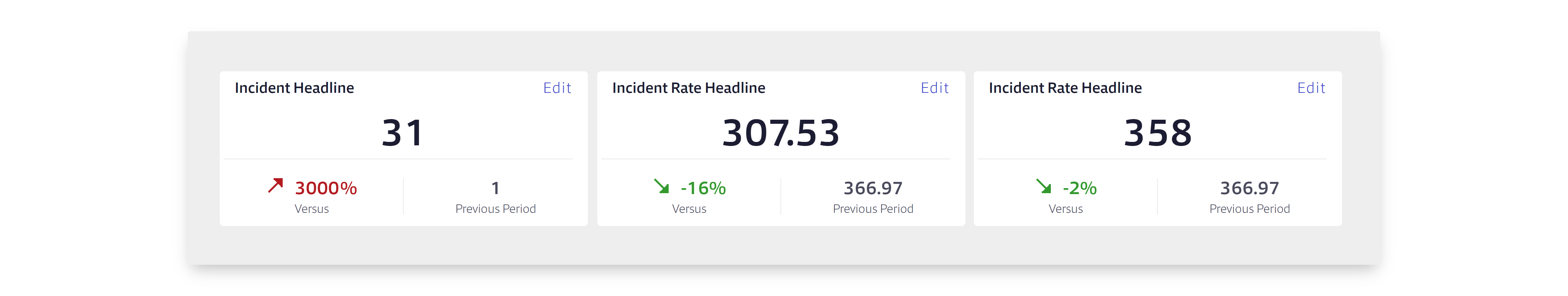
Providing Context to the Data
To monitor and communicate metrics more effectively, it was imperative that dashboard widgets not only visualize raw data, but also indicate how the data was trending, i.e., it wasn’t enough to indicate to an EHS manager that there were x-number of incidents reported at their facilities in the past 30 days, but also the percentage change of that datapoint over Y-period of time. The redesigned widgets offered much more context to indicate trends in data, warnings when thresholds were approached or exceeded, and metadata to indicate the timeframe the data was collected.